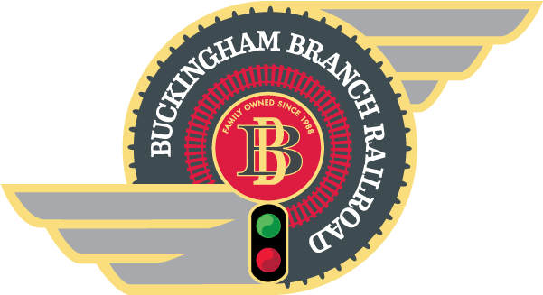
The Buckingham Branch logo embodies the spirit of railroading on the Buckingham Branch. It was designed to have the emblematic feel of traditional railroad logos with meaningful symbolic content, to represent what we do as a railroad, and to reflect the most important part of the Buckingham Branch, our people.
The two interlocking B’s in the center monogram represent interconnection, as in the interlocking of railcar couplers that makes the creation of a train possible, as well as a broader interconnectedness wherein railroads connect places and people, shippers and their customers, as we move the commodities so important to our economy and society. This interconnectedness happens through motion as represented in the overall circular form of our logo. The circle is a form that throughout human history and across all cultures has represented wholeness, balance, the cyclic nature of life, and importantly motion and the wheel, which railroading is based on. Circular motion and the rotation of the wheel also evoke dynamic energy and, in the case of railroads, this includes the generation of power via diesel fuel and electricity to move heavy loads over long distances.
The drive rods that connect the drive wheels on steam locomotives were the inspiration for having the wings staggered with one high and one low. This staggered visual element on opposite sides of the circle evokes the force of rotational, dynamic energy. Dynamic energy is further evoked by the clockwise turn in the charcoal circle of our name and the railroad track that circles into the clear signal indication and left wing. And dynamic energy is also present in each of the signal aspects with rotating tear drop forms.
All the primary railroad functions of the Buckingham Branch are represented in our logo. The track wrapping around the monogram represents the Track & Structures Department as well as the Mechanical Department that supports Track & Structures. The wayside signal (with a clear signal indication) represents the Signal Department and Rail Traffic Control. And the wings attached to the circle represent the Transportation Department and the Locomotive Mechanical Department which supports Transportation.
Additionally, the small bump-like demarcations around the perimeter of the central charcoal circle represent the steel rivets and bolts that hold together locomotives, railcars, track and bridges.
Finally, in the monogram circle above the interlocked B’s, there are two important facts about the Buckingham Branch: That we are family owned and were founded in 1988.
We take pride in the fact that our logo is unique with its asymmetrical shape, sense of dynamic rotational energy, and symbolism. It looks like no one else’s. As a privately-owned, family-owned short line railroad with a strong commitment to ethical principles and social responsibility, we feel we stand out from the rest and our new logo reflects this.


